InApp Templates
Fyno’s InApp template editor allows you to configure your template for Fyno’s InApp services.

On Clicking InApp, you can see:
- Title: Enter a title for your template, this is an optional field but it really helps to give a short context about your notification.
- Body: Enter the main body content of your template, you can use the rich text options provided in the editor to make your text more appealing.
- Tag: Only one notification with the same ID will be shown in the notification center. Use the same ID to update an existing notification instead of showing a new one. The character limit is set at 64 characters.
- Action URL: This is the main action of the notification when the notification tile is clicked. You can either enter a valid HTTP/HTTPS URL or a route starting with “/” if you want to route them within the same path. By default, the given URL opens in a new tab, but in case you want it to open in the same tab, just check the checkbox provided right under it.
- Icon URL: By default the icon used in the template is the image provided to the SDK. You are also provided with the option to override that icon for each template. If no value is given here the default icon will be used. The URL of the image should be public. Supported file types are jpeg and png.
- Attachment Type: You can add any one of the following attachment options along with your template:
- None: No attachment added
- Image: Add an image attachment to your template to make it more attractive. The URL of the image should be public. Supported file types are jpeg and png.
- Video: Add a video attachment to your template.The URL of the video should be public.
- Document: Add a document to your template. The URL of the document should be public.
- Call To Actions: You can add up to three CTA buttons to your template. Each of these buttons has the following configurations:
- Button: This is the title of the button.
- Primary Button: This checkbox allows you to add a primary/highlighted button to the template
- Link: This is the action added to the button. You can either enter a valid HTTP/HTTPS URL or a route starting with “/” if you want to route them within the same path.
- Open in the same tab: By default the action/link opens up in a new tab. If you want to open the link in the same tab, check this box to do so.
- Add another: This button adds a new button to the template
- Delete: Allows you to delete the previously created button.
- Preview: Review your content and take a look at what your message would look like in the Preview section on the right. This section shows the notification panel that comes with the Fyno InApp SDK.
- Save & Save and Promote: Save and create different versions of the templates by hitting Save which will be Test versions. Use Save & Promote when you are ready to move your template into the "Live" version.
To use any user property in your templates, you can add it in this format - {{$user.$<user_property>}}. For example, to add Name as placeholder from User profile, you can add it as {{$user.$name}}
All the links in the preview will always open in a new tab, even when "open in the same tab" is selected.
You cannot use only numeric values as placeholder keys!
How to add dynamic content in template
You can add dynamic content in your templates using one of the 4 options mentioned below.
How to test InApp template
You can use this feature to conduct thorough testing of a template prior to its inclusion in any Notification Event. This ensures the early detection and resolution of any potential issues, ensuring a seamless user experience.
- Click 'Run Test' on the top right hand side of the template.
- It opens the pop up as shown below.
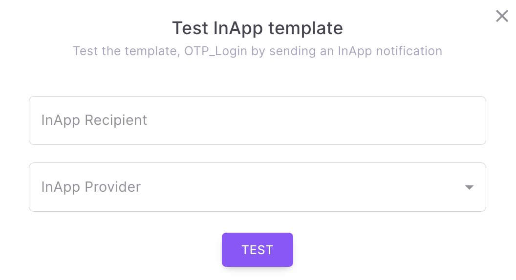
- Enter the InApp token of the recipient where the InApp Notification should be sent.
- Select a InApp service provider which is already configured in Fyno.
- When you click 'TEST', it will send InApp notification to the recipient with the selected service provider. You will see the success or failure message along with the link for Sent Logs.
Updated about 1 month ago