Dashboard
Fyno's Dashboard gives you a clear and crisp understanding of the performance of your notifications with respect to multiple factors.
This is an immense value add to your monitoring dashboard arsenal, you will fall in love with how easy it is to use.
To understand the value add each component brings to the dashboard, let's have a quick look around!
Typically, whenever you sign into the Fyno App, the first page you will land on is the Dashboard.
You will see the welcome screen and a button to take you to the Integrations page, the Start Integrating button since that's the logical starting point for any great notification journey!
In case you are a seasoned Fyno user, you will only see "View Integrations".
Filters
There are a couple of filters on the Dashboard to help you narrow down and visualize only the data you need to see.
Time Filter
A time filter, allowing you to toggle between the below-mentioned options helps you narrow down the date range for the dashboard.
- Today
- Yesterday
- Last 7 days
- Last 28 days
- Custom
Version Filter
On the top right corner, you can also toggle between versions, that is, Live and Test versions and visualize the data in each version easily.
Sticky Filters!
Scroll with it, your filters will come along with you!
Overview and Insights
Once you have used the Fyno app, you can have an overview of your account along with the Insights section on the top.
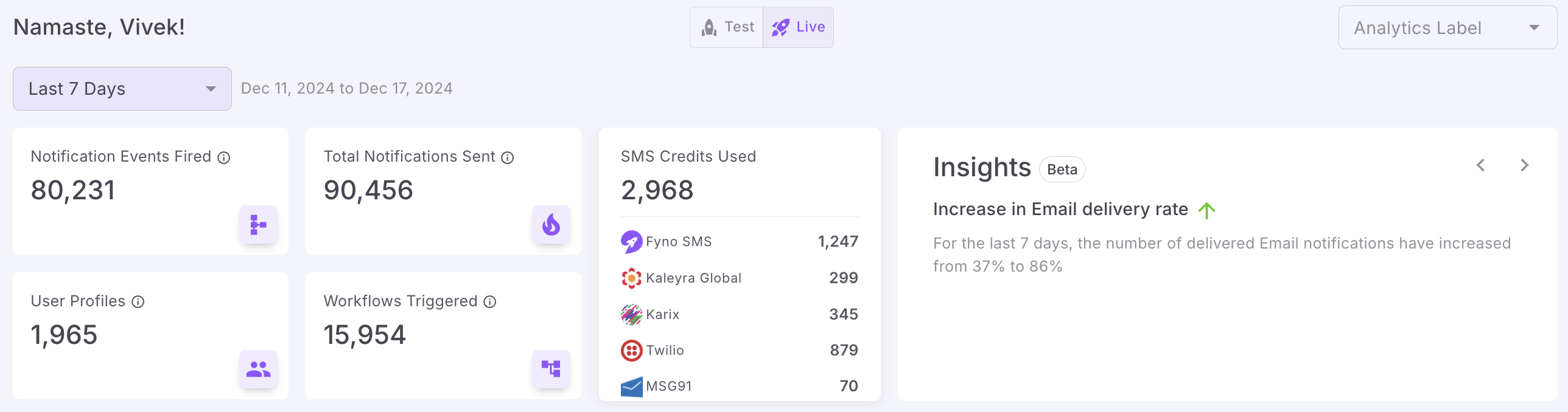
This is basically a ticker to track the count of:
- Notification Events fired: This will give you a count of the Notification Events triggered via Fyno.
- Total Notifications sent: This will give you a count of all the notifications triggered through Fyno. A Notification Event can have multiple notifications being triggered too. So this number may not match the Total Notifications fired count!
- User Profiles : The no of user profiles added or modified in the selected time period will be shown here.
- Workflows triggered: A count of workflows that have been triggered will be displayed.
- SMS Credits Used - Shows the no of credits used by different SMS service providers in your workspace. This helps you to keep track of the SMS Cost.
- Insights: Based on your Fyno account usage and date range selected, Insights will be generated and displayed here. For example, if the time filter selected is 7 days, on the 15th of January, then the trends will be displayed by comparing the 7-14th dates' to the 1-6th dates' data and providing you insights on that. Some of the insights you may see are:
- Total Notification Events fired increased/decreased by x%
Example: In the last week, total events fired (1120) increased by 12% compared to the previous week (1000) - Error rate increased/decreased by y%.
Example: In the last week, errors (50) increased by 5x compared to the previous week (10).
- Total Notification Events fired increased/decreased by x%
- Analytics Label - The analytics label filter at the top right corner helps you to look at analytics based on the analytics label you have configured in your notification events. You can read how to configure analytics label here and how to use it in notification events here.
Visualization
To get the best out of each of the visualizations, let's run through each one to understand how they work.
Channel Engagement
Channel Engagement, as the name suggests, helps you visualize just that. You can see these details either as a count or as a percentage (by toggling the radio button at the top of the visualization).

To understand the different types of statuses and what they mean, read more now!
Hover over the graphs for more details!
Hovering over any graph gives you more details about that point on the visualization. Go ahead, try it!
Delivery Status
Delivery Status has been designed to give you an understanding of the overall delivery of each channel which has been used, for a time period of your choosing.

Overall, you will get quick channel-wise insights regarding the final status of the notifications fired.
You can also select any channel you have used to see the trends for that channel from the drop-down at the top right corner.
Counts won't change, but trend lines will!
Based on the status, you will see that the trend lines will always be exactly the same mumber of notifications that have been triggered, since that number will not change!
Provider Performance
Provider Performance gives you an understanding of how exactly each of your providers (which are being used) is performing in terms of delivery. You can see these details either as a count or as a percentage (by toggling the radio button at the top of the visualization).

Activity Trends (Channel or Integrations)
Activity trends give you a graphical view on how either the Channels or the Integrations are being used for the time period selected.

Again, based on the channel usage on your account, you will be able to see a graphical representation for each on the graph.
Sent by Time of Day
Sent by time of day shows you the data of every notification sent via the application, relative to the time of day that it was sent.

By choosing your time range, you can see trends of usage by time of day, which is a super important feature, since this gives you an understanding of your end customer behaviour.
When you look at the plotted graph, you will see the legends as Low, Medium and High. These are calculated based on the overall volumes of traffic of your account and are relative to it.
Automation Actions
Automation Actions gives you insights into the functioning of your Automations and the success or failure graphs of the same.

Top Events
To understand which of your Notification Events are being triggered the most, have a look at the Top Events graph.

Updated about 1 month ago