Push Templates
On Clicking Push, you can see:

- Title: This is the title for your template. It's an optional field but helps summarise and give context to the template
- Message Content: This is the body of the template, where the main content of the template goes. This is a required field.
- Action Button: (Optional) Provide a name for the button. Along with the button, provide the link that clicking the button would lead to. You can use deeplink URLs here. You can either enter a valid HTTP/HTTPS URL or a route starting with “/” if you want to route them within the same path. This can only be used with Fyno Push, Xiaomi Push and Onesignal Push.
- Android: Additional settings for Android platform:
- Image URL: URL of an image that will be downloaded on the device and displayed in a notification. Supported file formats are JPEG, PNG and BMP. WebP and HEIF support will vary across platforms.
- Destination URL: The link you would like the customer to access when they click on the notification. For all URL values, HTTPS is required. You can also use Deeplinks.
- Icon: An icon you want to be displayed on the notification.
- Color: Background colour for the icon provided.
- Sound: Sound to be played when the notification is received on the device. The device's default sound will play when this is not set and, for grouped notifications, the sound file must be added to the project The formats allowed are: .wav, .aiff, .caf (do not include file extension)
- Badge: Sets the number of items this notification represents. It may be displayed as a badge count for launchers that support badging.
- Tag: Only one notification with the same ID will be shown on the device. Use the same ID to update an existing notification instead of showing a new one. The character limit is set at 64 characters.
- Ticker: Sets the "ticker" text, which is sent to accessibility services. Prior to API level 21 (Lollipop), this helps set the text that is displayed in the status bar when the notification first arrives.
- Collapse Key: An identifier of a group of messages that can be collapsed, so that only the last message gets sent when delivery can be resumed.
- IOS: Optional Settings for IOS platforms:
- Image: URL of an image that will be downloaded on the device and displayed in a notification. Supported file formats are JPEG, PNG and BMP. WebP and HEIF (subject to recipient's device).
- Subtitle: Additional information that explains the purpose of the notification.
- Icon: The display icon which will be shown on the top status bar and to the left of the notification text, unless a large icon is set. A bell icon is shown by default. Do not include the file extension.
- Sound: The name of a sound file in your app’s main bundle or in the Library/Sounds folder of your app’s container directory. Specify the string “default” to play the system sound.
- Badge: The number to display in a badge on your app’s icon. Specify 0 to remove the current badge, if any.
- Collapse Key: An identifier of a group of messages that can be collapsed, so that only the last message gets sent when delivery can be resumed.
- Additional Settings:
- TTL: An identifier of a group of messages that can be collapsed, so that only the last message gets sent when delivery can be resumed. You can enter the value in the first field and select the unit of time in the second field.
- Analytics Label: Use this analytics label, if you want to track the analytics of a Push template in Google Analytics.
- Priority: Priority of a message to send to devices. Note this priority is a concept that controls when the message is delivered
- Additional Data: This is an additional field that can be used to send some extra information along with the notification and used to render something on the device. Or can be used to send a data/payload message push notification. If you use Event listeners instead of Deeplinks, you can add any payload which can be used for redirection within your app.
- Preview: Review your content and take a look at what your message would look like in the Preview section on the right.
- Save & Save and Promote: Save and create different versions of the templates by hitting Save which will be Test versions. Use Save & Promote when you are ready to move your template into the "Live" version.
To use any user property in your templates, you can add it in this format - {{$user.$<user_property>}}. For example, to add Name as placeholder from User profile, you can add it as {{$user.$name}}
You cannot use only numeric values as placeholder keys!
How to add dynamic content in template
You can add dynamic content in your templates using one of the 4 options mentioned below.
How to test Push template
You can use this feature to conduct thorough testing of a template prior to its inclusion in any Notification Event. This ensures the early detection and resolution of any potential issues, ensuring a seamless user experience.
- Click 'Run Test' on the top right hand side of the template.
- It opens the pop up as shown below.
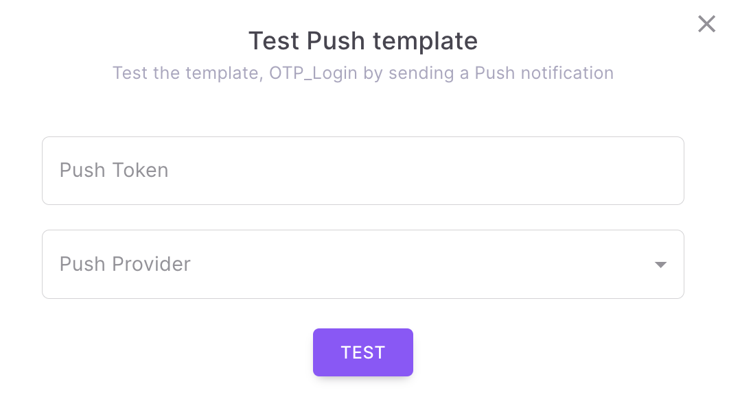
- Enter the push token of the recipient where the Push Notification should be sent.
- Select a Push service provider which is already configured in Fyno.
- When you click 'TEST', it will send Push notification to the recipient with the selected service provider. You will see the success or failure message along with the link for Sent Logs.
Updated 4 days ago